Motion Slide Menu
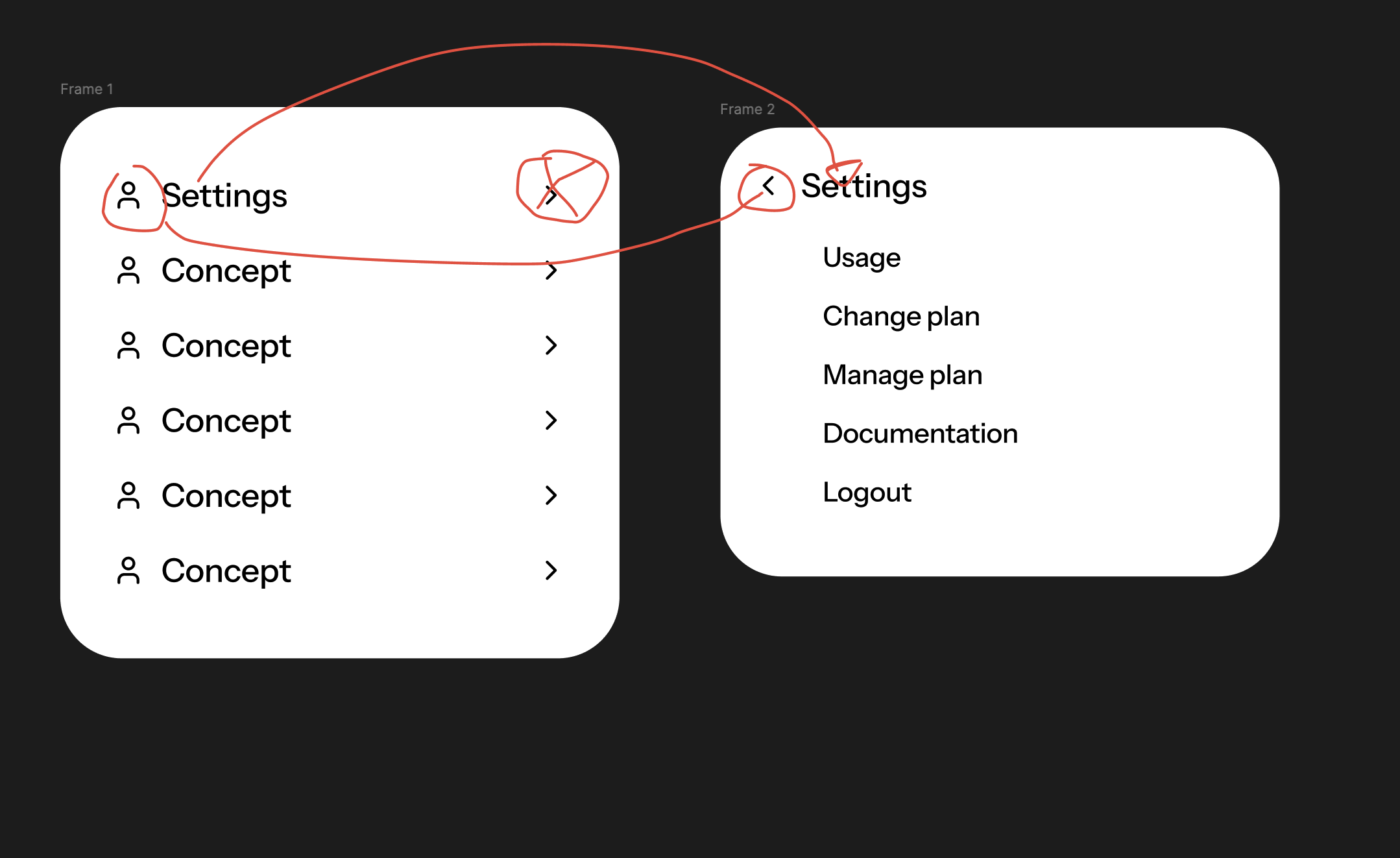
An animated React multi-level slide menu with recursive nested navigation, morphing category headers, and direction-aware transitions.
Installation
Pro components require registry authentication. Add your Unlumen UI Pro key as UNLUMEN_LICENSE_KEY in your .env.local file and follow the setup guide.
File Structure
Usage
API Reference
MotionSlideMenu
| Prop | Type | Default | Description |
|---|---|---|---|
items | MotionSlideMenuItem[] | - | Recursive items rendered by the menu. |
onItemSelect? | (item: MotionSlideMenuItem) => void | - | Called when an enabled leaf item is selected. |
path? | string[] | - | Controlled category path, expressed as an ordered array of item ids. |
defaultPath? | string[] | [] | Initial category path when the menu is uncontrolled. |
onPathChange? | (path: string[]) => void | - | Called whenever the user opens a category or goes back. |
backLabel? | string | "Back to" | Accessible prefix used by each back button. |
rootLabel? | string | "main menu" | Accessible name for the root list and the destination of its back button. |
springDuration? | number | 0.28 | Duration of the directional and height transitions. |
springBounce? | number | 0 | Bounce applied when the duration-based spring configuration is used. |
springStiffness? | number | - | Spring stiffness. Providing any physical spring prop switches the transition to stiffness, damping, and mass. |
springDamping? | number | - | Resistance applied to the physical spring. |
springMass? | number | - | Mass of the physical spring. |
springEase? | "linear" | "easeIn" | "easeOut" | "easeInOut" | [number, number, number, number] | [0.23, 1, 0.32, 1] | Easing used by tweened icon transitions and the reduced-motion fallback. Physical springs do not use easing curves. |
itemClassName? | string | - | Additional classes applied to every menu control. |
maxHeight? | React.CSSProperties["maxHeight"] | "min(32rem, calc(100dvh - 2rem))" | Maximum panel height. Longer levels scroll inside the rounded container. |
className? | string | - | Additional layout classes applied to the navigation root. |
MotionSlideMenuItem
| Prop | Type | Default | Description |
|---|---|---|---|
id | string | - | Unique identifier used for navigation and shared-layout morphing. |
label | string | - | Visible item label. |
icon? | React.ReactNode | - | Icon rendered before the label. |
href? | string | - | Anchor destination used by leaf items. |
children? | MotionSlideMenuItem[] | - | Nested items. When present, selecting the item opens another panel. |
disabled? | boolean | false | Prevents navigation or selection. |
variant? | "default" | "destructive" | "default" | Visual treatment for the item. |
onSelect? | (item: MotionSlideMenuItem) => void | - | Callback scoped to an enabled leaf item. |
target? | React.HTMLAttributeAnchorTarget | - | Anchor target used when href is provided. |
rel? | string | - | Anchor relationship used when href is provided. |
className? | string | - | Additional classes applied to this item only. |
Notes
- Items with children can be nested to any depth. Keep every
idunique across the complete tree so shared-layout transitions never collide. - Forward navigation moves the previous content left and introduces the next content from the right with a subtle 8px upward settle, using the same 60% directional slide as Motion Tabs Menu. Back navigation reverses both directions and adds the same subtle vertical travel.
- The selected category keeps the same keyed row as it moves into the header. Its icon crossfades into the back chevron inside a fixed-size slot, preventing label shifts and SVG path interpolation.
- Child rows are indented from the active header to reinforce the current navigation depth.
- Menu controls transition their colors in 75ms. On hover, non-destructive leading icons and chevrons become fully foreground-colored.
- The panel height follows short levels and becomes internally scrollable once it reaches
maxHeight. - Use
pathwithonPathChangeto synchronize the active level with a router, URL, or external state. UsedefaultPathwhen the menu should manage itself. - Arrow keys move between controls, Arrow Right opens a category, and Arrow Left or Escape returns to the previous level. Keyboard navigation moves focus to the new logical target without spatial animation.
- Pointer activation keeps focus on the category as it becomes the header and adds a subtle press response.
- Reduced-motion preferences keep the navigation state changes while removing horizontal and vertical travel.
springDurationandspringBounceconfigure the duration-based spring. ProvidingspringStiffness,springDamping, orspringMassswitches to Motion's physical spring model;springEaseremains scoped to tweened transitions because physical springs do not use easing curves.
Original idea
Credits
Built by leo.
The animation language is based on Motion Tabs Menu.
Keep in mind
Most components on this site are inspired by or recreated from existing work across the web. I'm not here to take credit; just to learn, experiment, and sometimes push things a bit further. If something looks familiar and I forgot to mention you, reach out and I'll fix that right away.